01. The Task.
There are certainly few personalities in the world of biotechnology as charismatic as Laurent Levy, CEO of Nanobiotix and an enthusiastic researcher of nanotechnology for therapeutic solutions. When we were contacted to participate in an exciting new project, it didn’t take long before we were intrigued.
Our main task was to develop a communication strategy and corporate design that would reflect this amazing new technology that could open new horizons in the field of nanomedicine at the forefront of the future. We knew we had to go all out on the front-end design to do justice to this very special project.
Xphelyum
.to sense & live beyond reality
Xphelyum Digital Guides
.h256 .s75% .l50%
.r29 .g30 .b34
.h256 .s75% .l24%
.r249 .g249 .b249
02. The Branding.
In line with the mechanism of action*, the technology of this ground-breaking product idea needs to be presented in an unconventional and new way. Instead of introducing a fixed color scheme for the branding, we let the lettering and all surrounding elements change colors fluidly.
Subtle details such as the dot in front of the statement and the key phrases reflect the principle of the product. That of discovering new ways of feeling and adapting the senses beyond what we think is the physical limit. The sentences start after the period instead of being finished by it.
*We are not legitimized to explain the product’s Mode of Action. To learn more, you may click here.
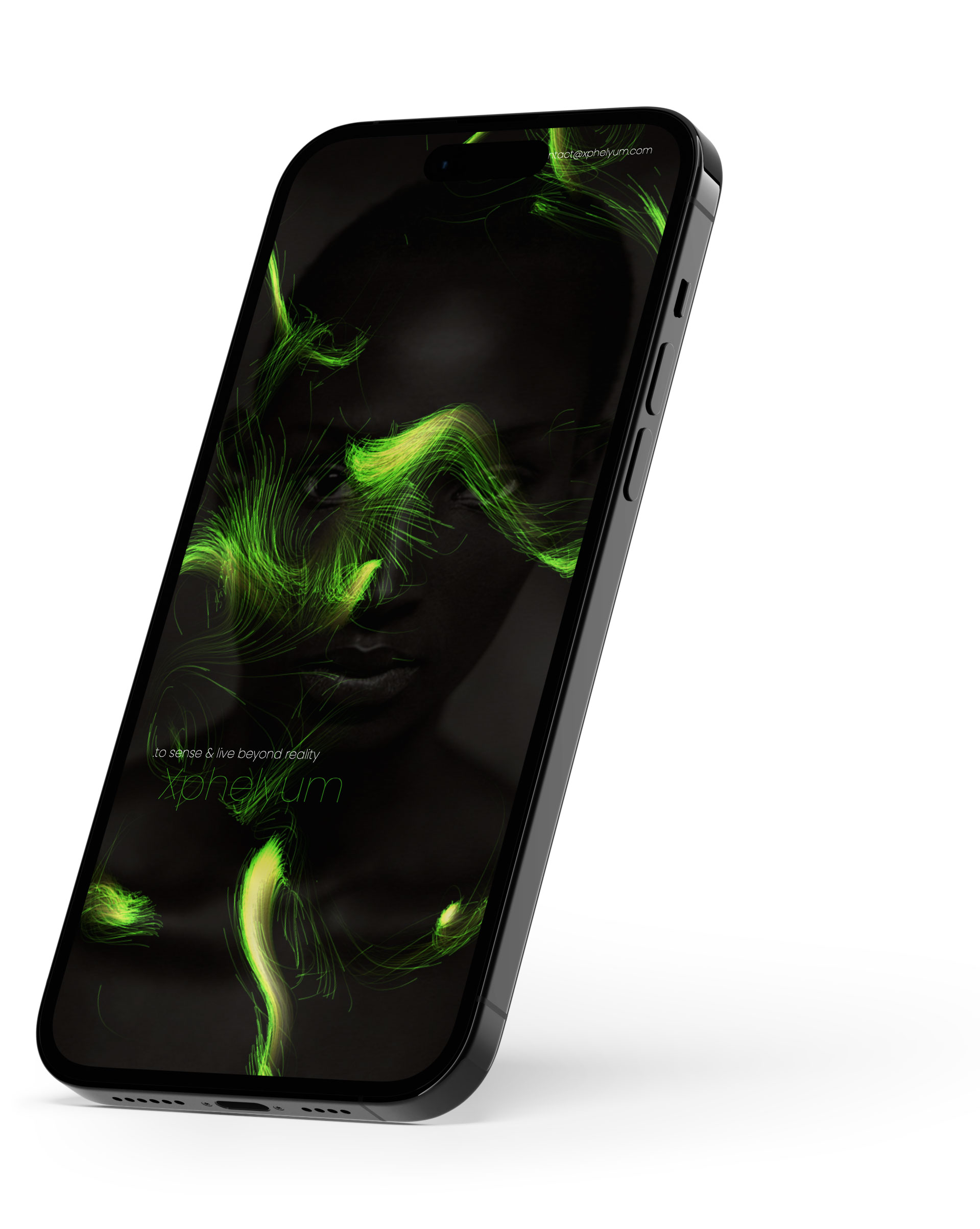
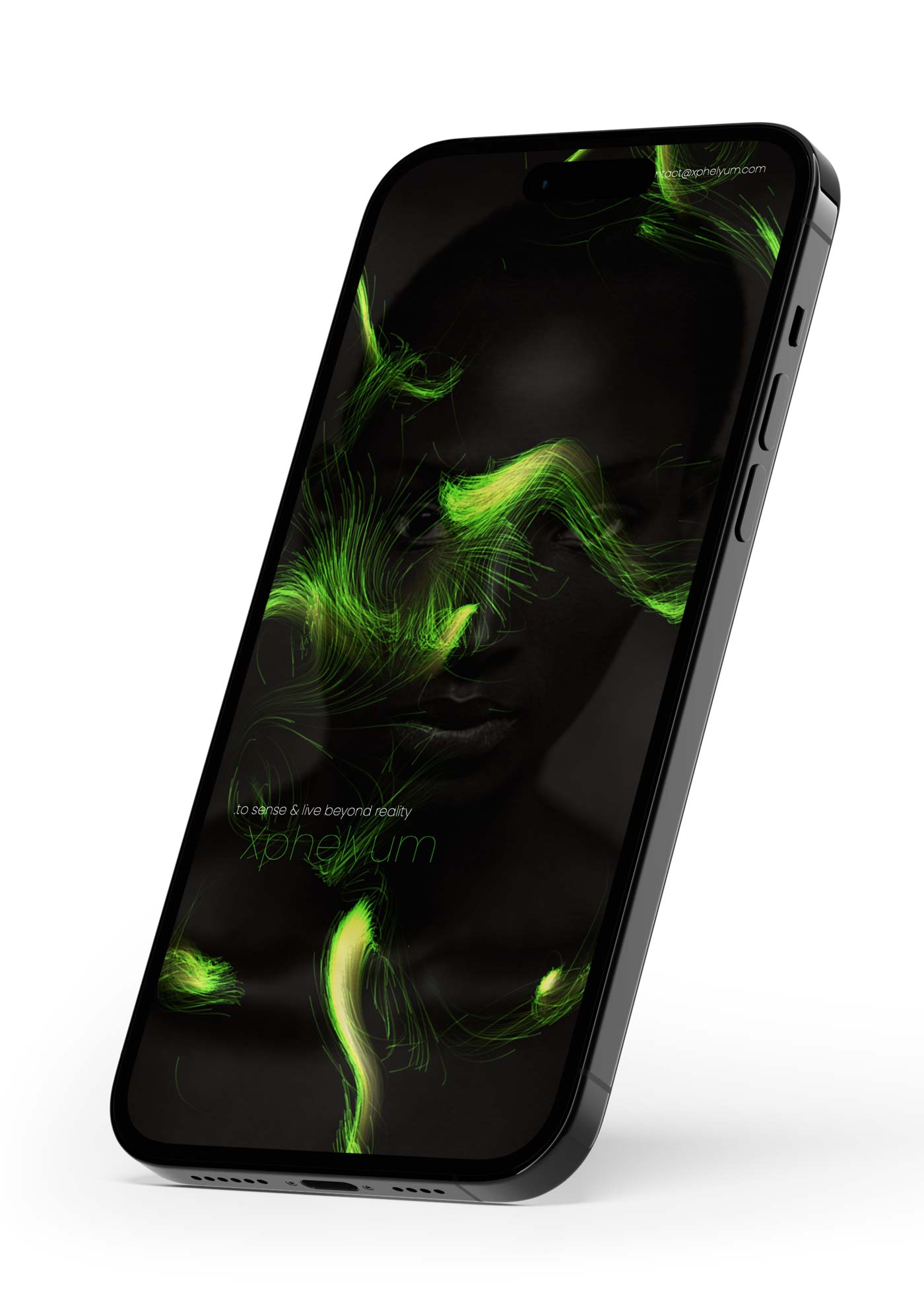
03. The Imagery.
The pool of images we have assembled serves as a matrix to define the cornerstones of this sensory experience. Dreamlike or fantastic landscapes overlap with psychological symbolism, haptic experiences with sensory enhancement. In the digital presentation, it functions as an animated navigation guide.
As the main protagonist key visual, an artificially created human face represents the core of the product: the future of mankind. For us, from both an emotional and a scientific point of view, the human being is at the center of all biotechnological progress, whether today or in the future.
Fluid Color Contrast and Variable Fonts. Try here.
.h90 .s75% .l50%
.font-weight 100
04. The Effects.
Integral to the animated corporate design are the moving, sensual wave lines created by Javascript programming code. To this end, we adapted existing code snippets, such as that of Dutch programmer Bas Groothedde. In some cases, we designed them to react on scroll or interact with images or diagrams.
In order to use the sensory waves as a versatile, recurring layout element, we had to keep all possible performance issues under tight control. Finally, color contrasts and typographic details were carefully revised and optimized to smoothly adapt to all different device sizes, balancing subtlety with impact.
05. The Application.
One of the most common and potentially frustrating issues in maintaining a corporate design over time is the constant need for support for teams creating their off or online presentations. That’s why we offer our clients convenient website contracts to help them with this task and keep design standards high.
For this particular project, however, we wanted to go even further. We launched a small web application that allows scientists to create their own individual presentation materials step by step. You can configure sample pages, logo, claim or background elements and of course the digital guides are provided.
Bug Fix Font