Another Biotech Challenge.
As a part of our contract for French biotech rocket Nanobiotix we were committed the Curadigm corporate design and web apps.
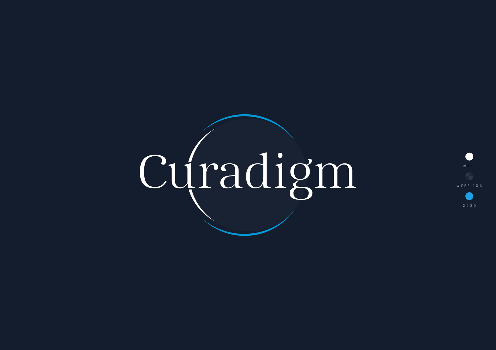
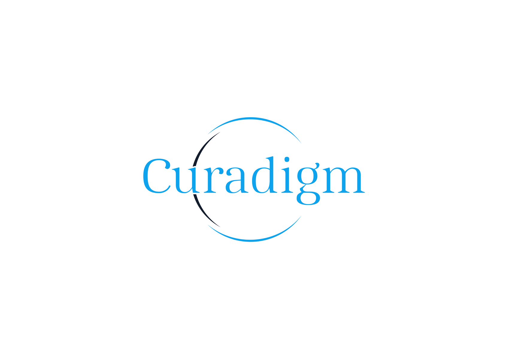
A highly intensive research work for the logotype design took its time but finally all teams were happy. The logotype reflects the special work mode of nanoparticles in a revolutionary drug application concept.
The Corporate Design.
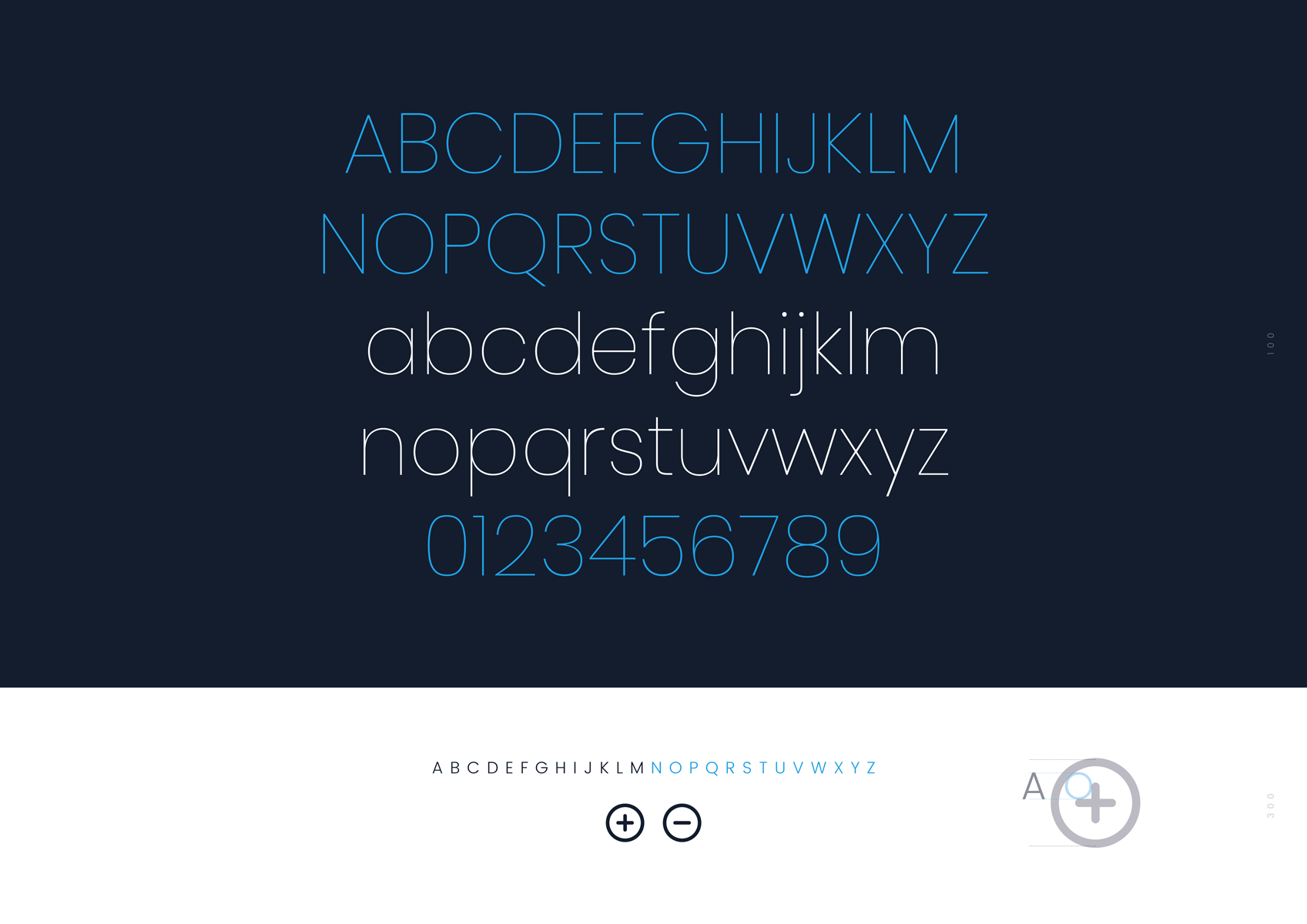
A special challenge was the typography and illustrative guides for this biotechnology corporate design. This started with a typeface customization and ended with the right web typography to be aligned with its distinctive character.
The Type Design.
Not always it is necessary to create a new typeface from the scratch to add that kind of uniqueness to a logotype. But it is almost every time necessary to adapt a standard font to a special need, to make it fit into a particular surrounding. Like it was the case with Curadigm logotype.
We had those ultra slim lines which built the initial letters of C and D forming a kind of protecting globe, something like a shield. The serif typeface was modified in weight and Bézier curves were specially handled to integrate into those line structure.
Bug Fix Font


