01. The Motivation.
Many many years we worked for Mercedes-Benz Berlin* on a daily basis. And those were exiting years! So, we decided to put some of the most rememberable works and experiences together in an automotive portfolio.
Our first idea was to make some kind of potpourri with black and white photographies to give it a nostalgic touch and somehow historic documentation style. Since some of these works go back in the past really over a quite large period of time. In addition, we wanted each of the images equipped with extra information and inside background knowledge from people who created it.
As we started with the work it became quite soon obvious that we’d have a longer way to go and so many stories about Mercedes-Benz Berlin seemed worth to us to be told! Furthermore, we wanted to tell about experiences and document processes rather than just showing the results.
So, first of all, we condensed the material a lot and tried to find something like a red thread. And speaking about time, we found the most convincing solution is to do it chronological. What on the one hand feels like scrolling through time passing, on the other hand is a timeline for each single work process.
(*Stefan Seifert on behalf of the Qfufs Bsoeu Xfscfbhfouvs)
Main Timeline Fluid Scroll
02. Background.
In the pages’ background work probes from our portfolio for Mercedes-Benz Berlin are presented in black and white style, with images turning to color after a user stays over one of the five sub sections. Namely, these parts are the heading title (experience), conception, art, realization and, finally, a brief contact interface.
03. Contents.
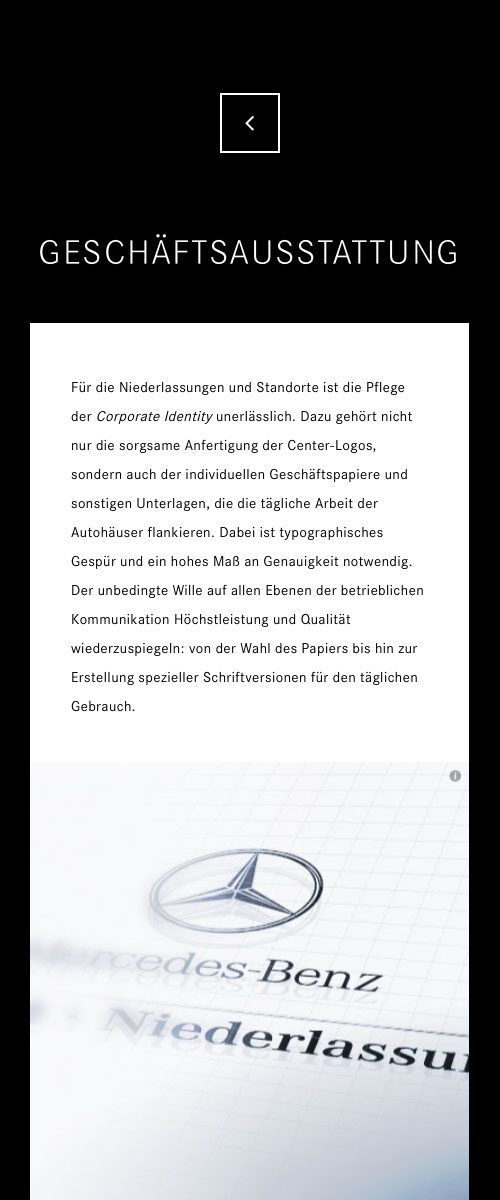
Generally, each of such sections is designed to explain in a chronological way single components of work processes, which typically evolve while bringing into life a new publicity campaign or other advertising materials. The spectator get’s to know about routine work flows, many design aspects and, likewise, about the technical issues.
04. The UX Design.
Accordingly, extra content subpages are inserted by a nicely flowing ajax request avoiding url changes and delays. As a rule, maximal user comfort is in the center of this unique microsite web experience (UX). To conclude, each content item accessible on follow up pages, as diagrams or photos, is separately shareable on social channels.
Subpages Mobile
05. The Mercedes-Benz Typography.
We loved to maintain a sober and elegant boxed layout on all devices. Therefore, we elaborated complex CSS rules for a strict treatment of text based on typographic rules. In order to keep the body copy parts in their respective squares font sizes, spacing and line heights were individually recalculated.
Consequently, new custom Mercedes-Benz web fonts have been created for the occasion, containing different font weights and styles in relation to text sizes and headings.
Column design is flexible form 3, 2 to 1 columns with focus on the reading order. Special attention has also been paid to tablet devices regarding portrait and landscape orientation. As a rule, double square rectangles and single squares switch naturally between each other exchanging contents by javascript if necessary.
Finally, as a special editorial detail, transparent motto sections are inserted to intensify a captivating and well balanced reading experience.
(Click on the iPad Frame)
Bug Fix Font