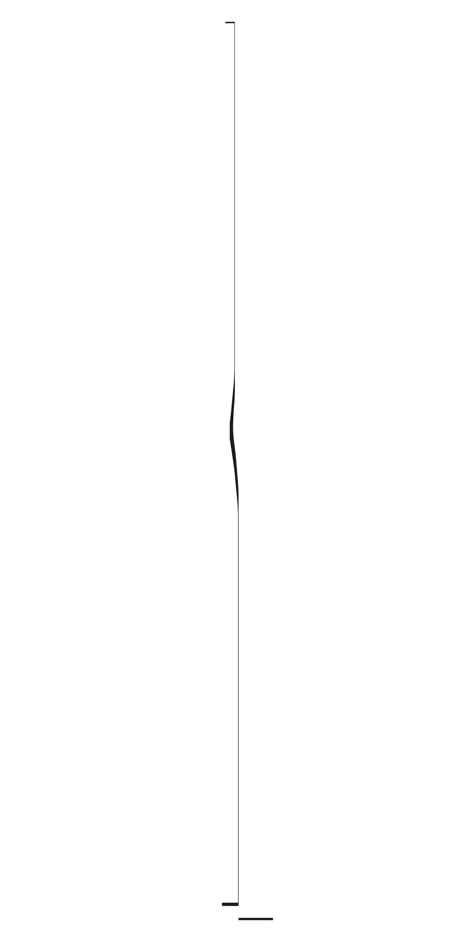
Urbino Typeface on www.stefanseifert.com (detail)

A LITTLE BIT OF HISTORY.
In the early beginnings of the art of printing with movable letters around 1500 the figure of the creator of a typeface and the one of the printer is identical. Meaning, that before starting to print a book and thus doing some kind of graphic design or layout work he had to produce a typeface on his own. The very first one who did this (speaking always of Roman typefaces, the ones we are used to read in Western hemisphere) was a frenchman called Nicolas Jenson.
By the way, it may sound curious, but typefaces of today haven’t moved so far away from what we see in his books. However, to open a discussion here of what oncoming generations did to replicate his mother version of a Roman typeface and how the story continued would by far go beyond the intention of this post. Let’s just state: yes, this early printer and hence kind of a “layouter” and therefor forefather of graphic design’s chief domain, was a type designer. Not only, he was one of the greatest.
THE SPLIT OFF OF GRAPHIC DESIGN.
Certainly, to skip the gap between an incunabula book and the outcome of modern graphic design would be worth a Kubrick like film cut between the ape throwing the bone and the resulting spaceships. Since, as often in history what caused the two crafts to separate from each other was the growing complexity of needs in both of them. On the one hand the demand for a production of typefaces on a vaster scale and on the other the more and more differentiating tasks a visual designer has to deal with.
Yet, something of this early heritage has remained in the DNA of graphic designers up till today. As we saw David Carson experimenting with melting font families. Time before magazine artists as Alexey Brodovitch invented new typefaces for fashion graphic design. In short, most of my designer colleagues in one way or another have that great respect for the creators of typefaces and more than one of them had felt the appeal of crossing the threshold to this fascinating industry.
THE HERITAGE.
In my case this was the creation of typefaces that were either re-interpretations of classic characters or the invention of new letter forms that could fit the style of a fashion griffe or be suited for perfume design. In my youth I redrew by hand elegant Caslons or Garamonds, mostly a beautiful italic version which was named Amsterdam. I learned about the generous spacing that those ancient characters had and what gives their letters air to breathe. It was extremely exciting.
Girl Typeface from www.stefanseifert.com
TYPEFACES. A PRECIOUS RAW MATERIAL.
Just as a side note it may be mentioned here that during my university years we went through the painful switch of two typeface production or better pre-printing generations. The first one a well grown and optimized photo typesetting technology with in our hands a vast library of excellent drawn typefaces. The latter digital desktop revolution with a huge potential on the horizon but at that time still very limited in the choice of good fonts ready to use.
Such an experience may lead us to dedicate more attention to the precious curves of which consists a beautiful typeface and which makes it differ from a blunt one. As often happens when it comes to beauty it depends on subtle details, slight irregularities and the instinct of a designer. And perhaps here the circle to graphic design closes. As letters can teach us important lessons about proportion, rhythm, harmony and, last but not least, a certain meticulousness.
THE EYE OF THE TYPEFACE DESIGNER.
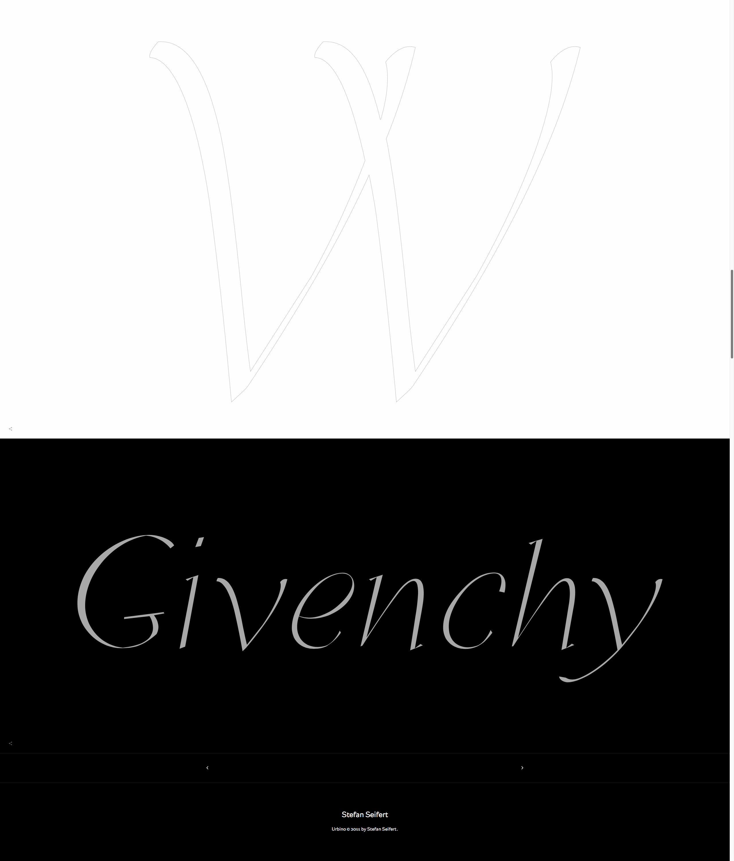
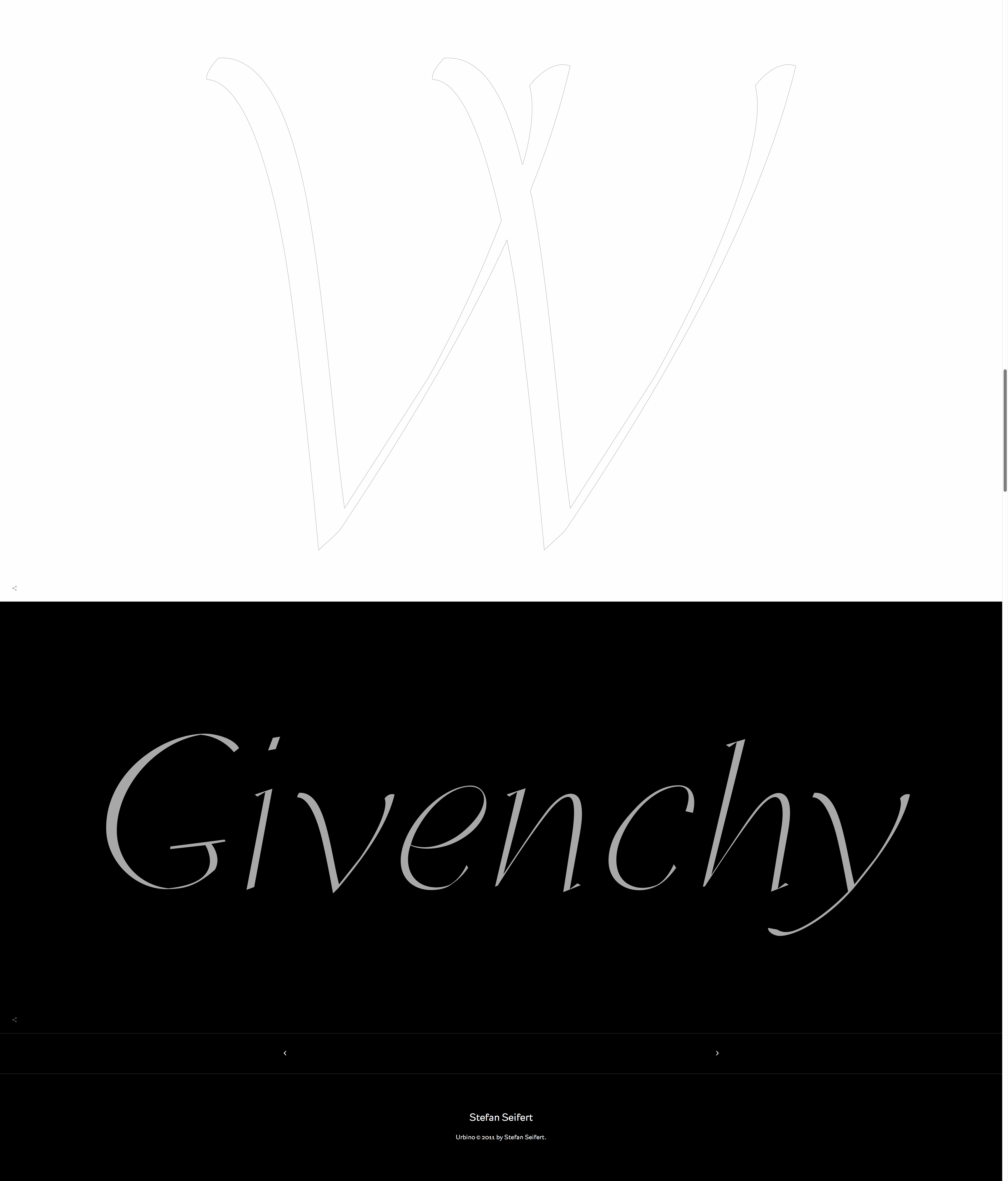
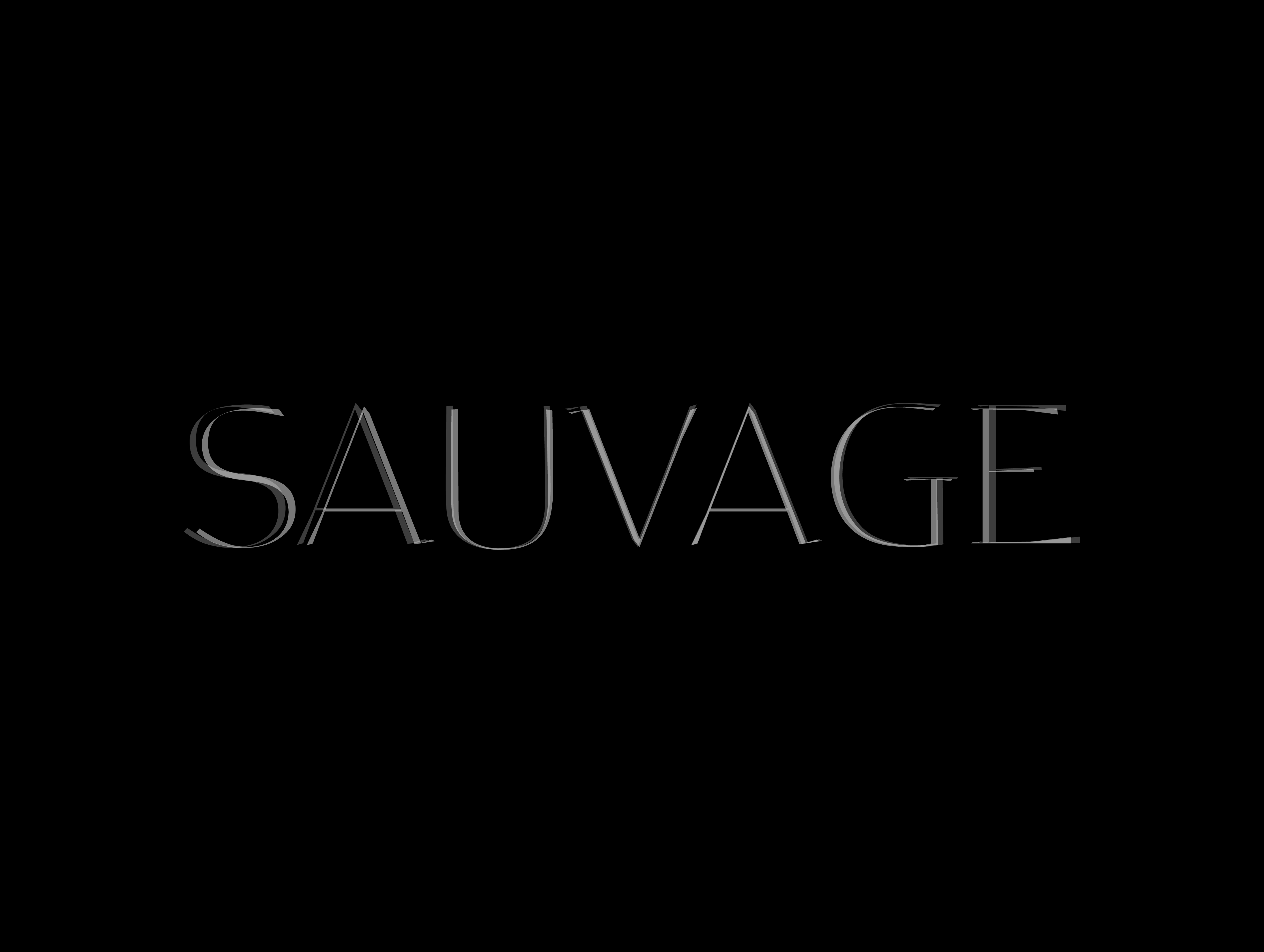
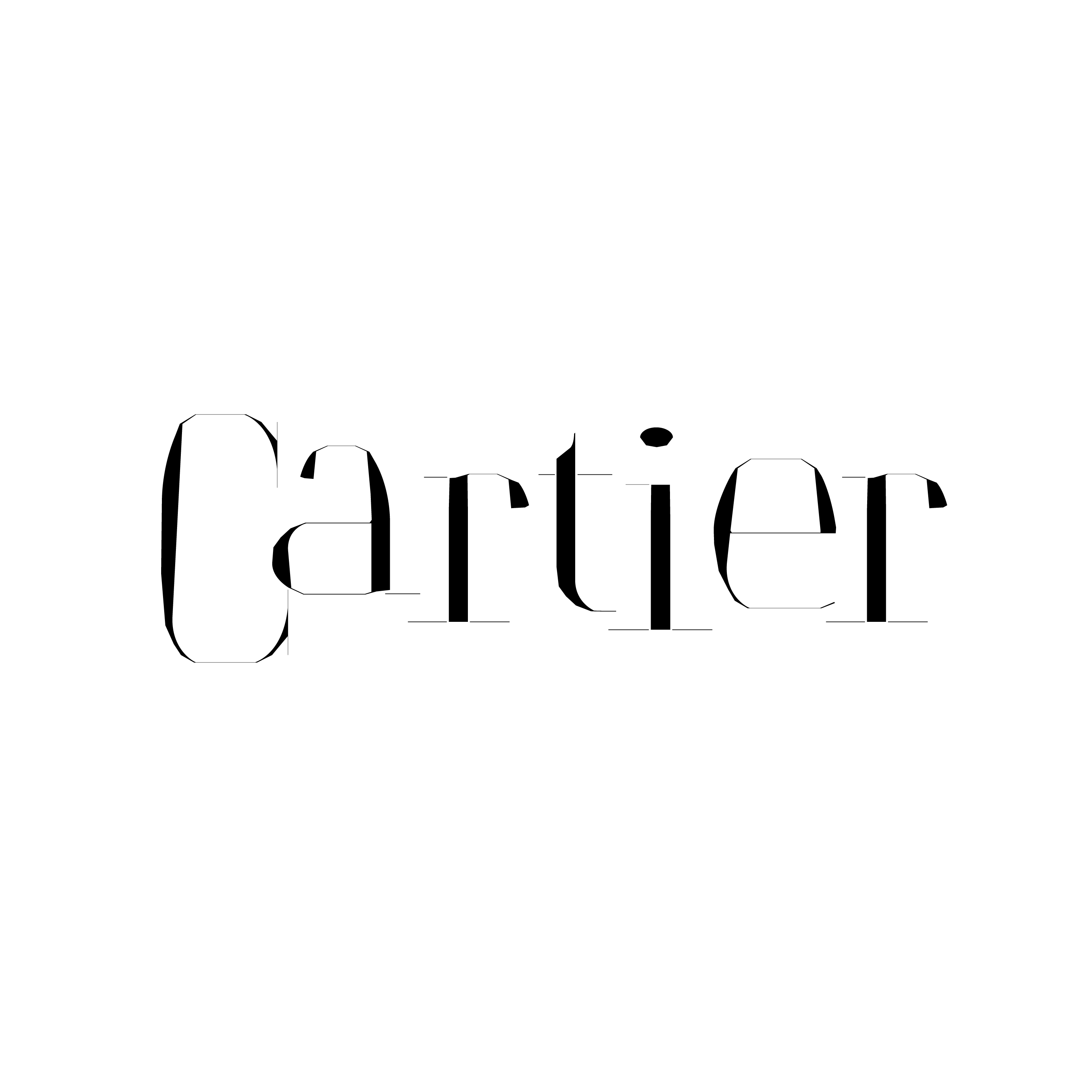
In the late nineties when I was introduced to Condé Nast’s (Italy) Franca Sozzani and her provocative art director Luca Stoppini I started to experiment with letter forms and to transform their shapes into a more personal means of expression (of whose results you can see some on this page). But like a pianist who studied classical music and ended up feeling at ease with jazz, I never lost touch with the classical forms canons with which everything began.
After all, even if I am doing marketing communication design for a living the fascination of getting to the heart of Roman alphabet never left me. And quite often when my clients ask me what it is what adds this special touch to our results in print and web design I keep my mouth shut. But I could also start a discussion saying something like: “Have you noticed the wonderful little curve that that ‘a’ makes at the bottom of its belly?…”
Spacing
One of the crucial and most experience based challenges while designing a typeface is finding the right spaces for each single letter. It is a game of give and take between singular forms that have to be united in a continuous flow without interruptions or excessive narrowing. It trains the designer’s feeling for rhythm and teaches him about the importance of blank space.
Rhythm
Spaces are the backbone of a character’s rhythm. But it’s deeply linked to the rhythm between forms within the letters themselves. Only if a typeface has the correct rhythm within its single parts it may catenate in a perfect line. And even between those lines vertical rhythm of its single parts grants the success of keeping them together to create a harmonious surface. A type designer which has undergone such a training is highly doted to work with text in general. He is able to connect parameters as a text block’s width with its lines’ length, font weight and font size to determine the success of a page.
Weight
Such rhythm gives him insights which weight or “color” a text needs to adapt to not irritate the eye in sizes too small or too big. As he knows about the needs bigger typefaces have to get thinner in color and narrower in line contrast to keep elegance. As well as he is trained enough to know that smaller typeface sizes need more weight to not shimmer before the eye or get unreadable.
Alignment
Alignment of a typeface means to be aware of the fact that round forms have to grow more below or above an imaginary line that horizontal forms more clearly determine. As a round form looses blackness and in an optical illusions seems to be higher or lower relative to a straight line when looked upon with an eye “out of focus” while slightly closed. A typeface designer painfully learns about these optical effects and automatically will be able to use it more generally in any type of graphic composition.
Combining
A typeface designer knows about history. He has to. So with time passing he learns about similarities that letter forms have even skipping between historical periods. He is trained to recognize subtle familiarities between a 1930 newspaper typeface and a classicism style as in french Didot. In most cases a typeface designer will develop an exceptional, yet unconscious feeling which letter forms may match each other in the combination of fonts.
Taste
Last but not least, each undertaking in art that needs to be based on a wide spread historical knowledge likewise an excellent piano player, will develop a certain “taste” which comes from years of experience and respect towards what others did before him. It is mostly accompanied by something that we even might call humility. If a designer succeeds to not succumb such experiences while keeping alive his very own personal spirit then such taste may lead him to greater results in general.

Stefan Seifert by: Thomas Pritschet
Stefan Seifert works as a type designer in parallel to his profession as a marketing communication designer and consultant. His free artistic typeface researches were published in Vogue Italia.
Related Articles
2Comments
Mattia Di Marcantonio
A study and application of typefaces that goes beyond merely ‘drawing with letters,’ communicating dedication and personality in every detail.
Masterful!
Stefan Seifert
Thank you, Mattia—your kind words are much appreciated!
Stefan Seifert