Website Layers
Preface
I thought for a while about whether to feature this as a project on our website or something else. It didn’t seem to fit with the rest. Not only because of the topic it tells about. Because books seem so far away from the big modern design topics like application development, UX design and so on. Still, I decided not to just skip it. Again, not because of the result, the final product, which is actually a website. But because it contains so many interesting facts about how it came to be and why it is “magic” to me. [Stefan Seifert]
01. Photography.
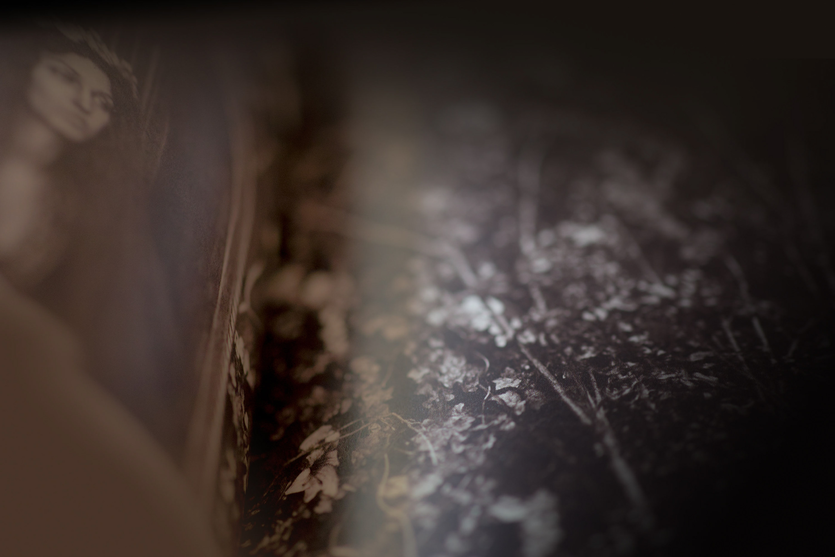
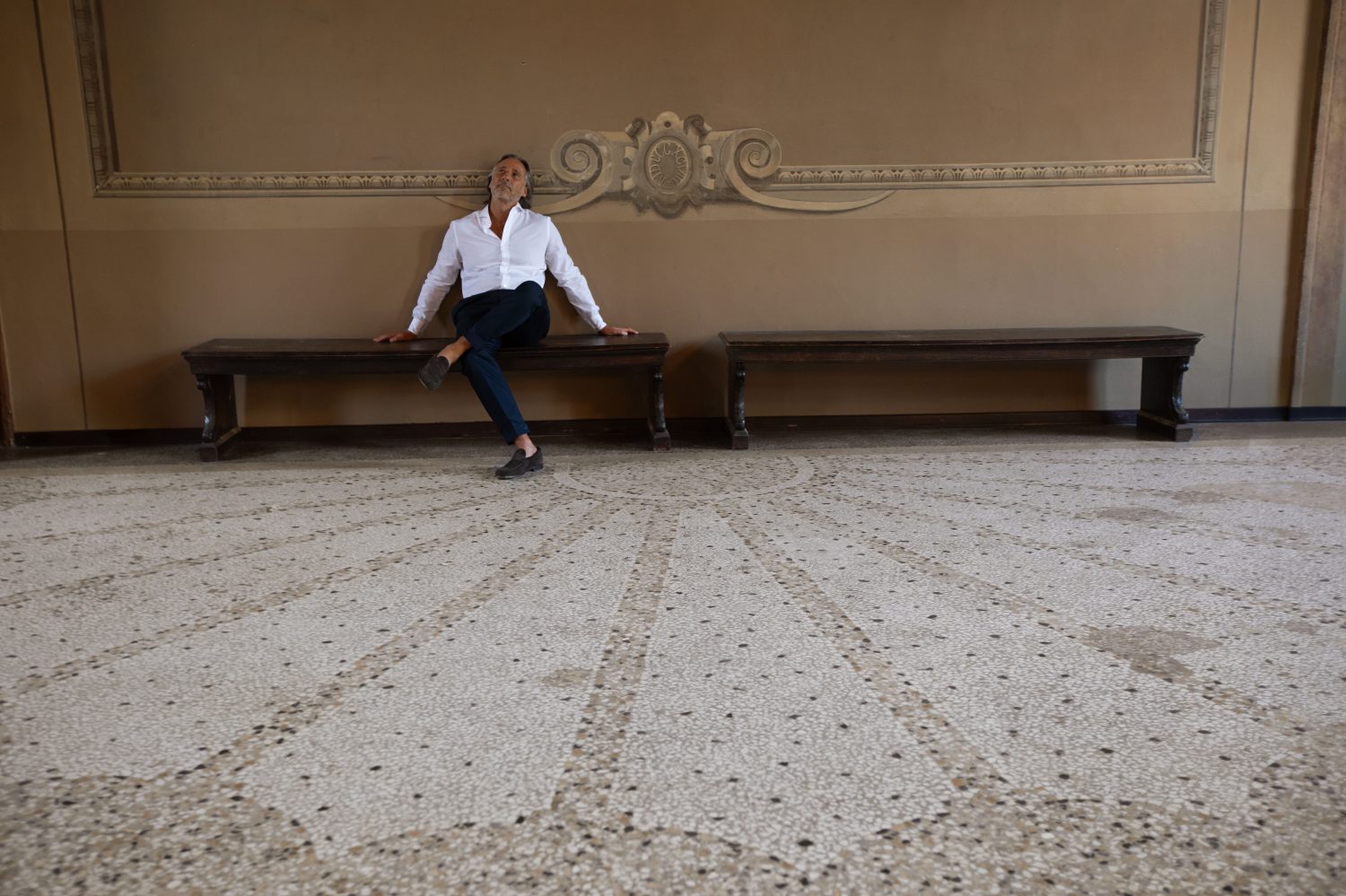
There are photographers who are very good at photographing people, others who are good at photographing architecture or landscapes, and so on. And then there are the artists. Not that the former are not also artists. Of course they are. But there are those who have a very special way of looking at things. They may not be the ones who can represent an object or a person in the best of all possible ways. But they see substance, mere ideas of something where other people see nothing special. We hired Italian photographer Antonella Iovino because she is one of those artists.
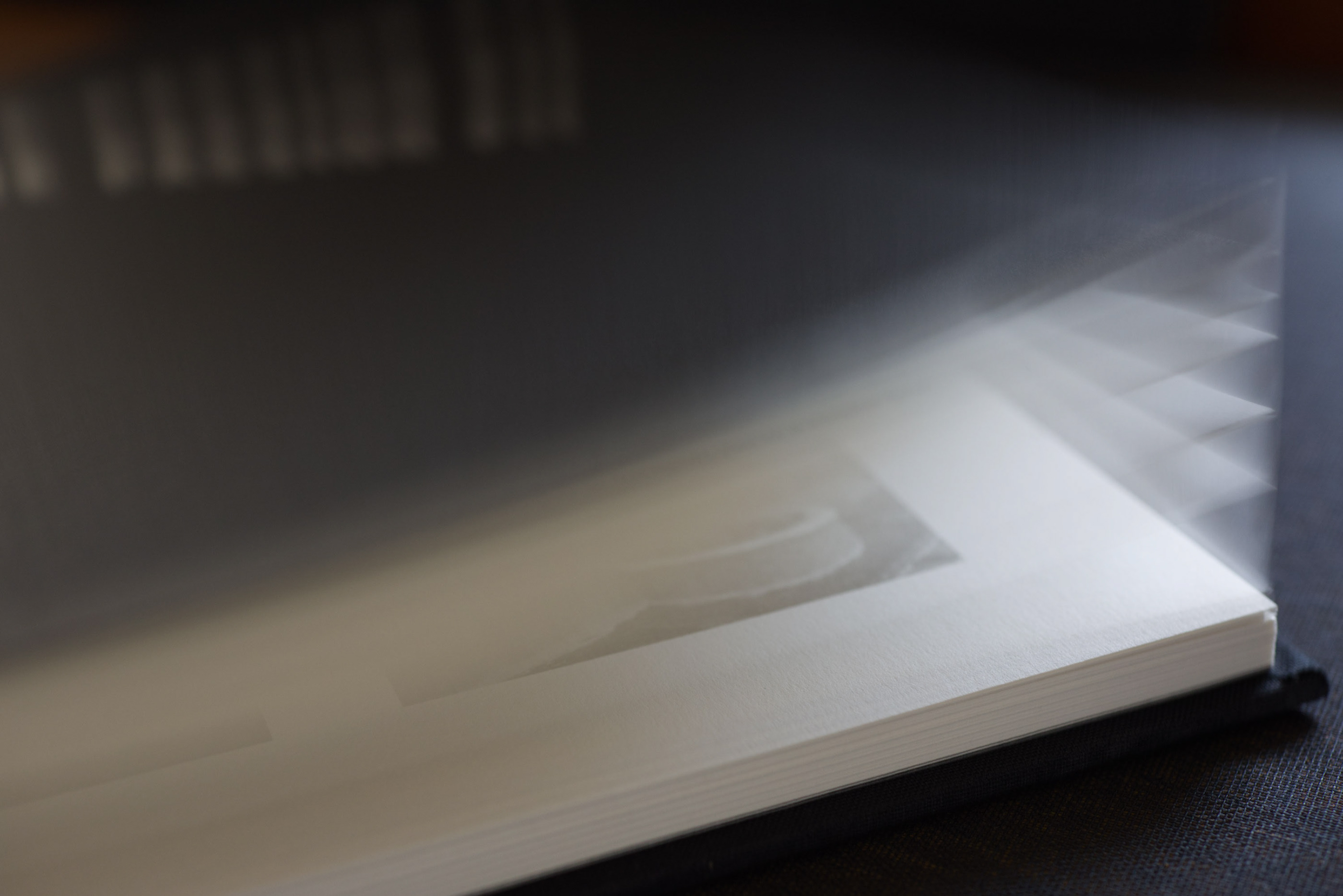
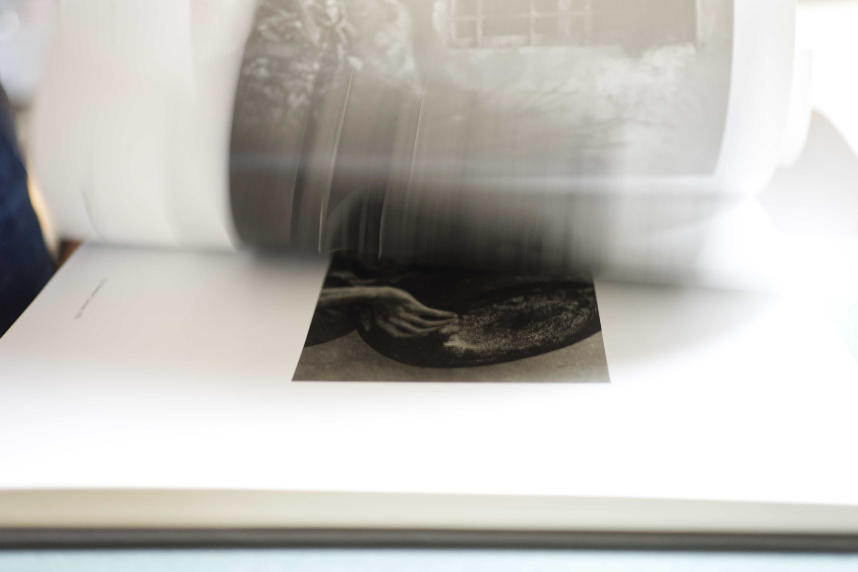
We needed this artistic quality to reflect the special tactile quality of the famous books Trifolio prints for museums and renowned artists around the world. The feeling you get when you run your hands over the turned pages, when you touch the high color density of the printed images.
02. Creating the Magic.
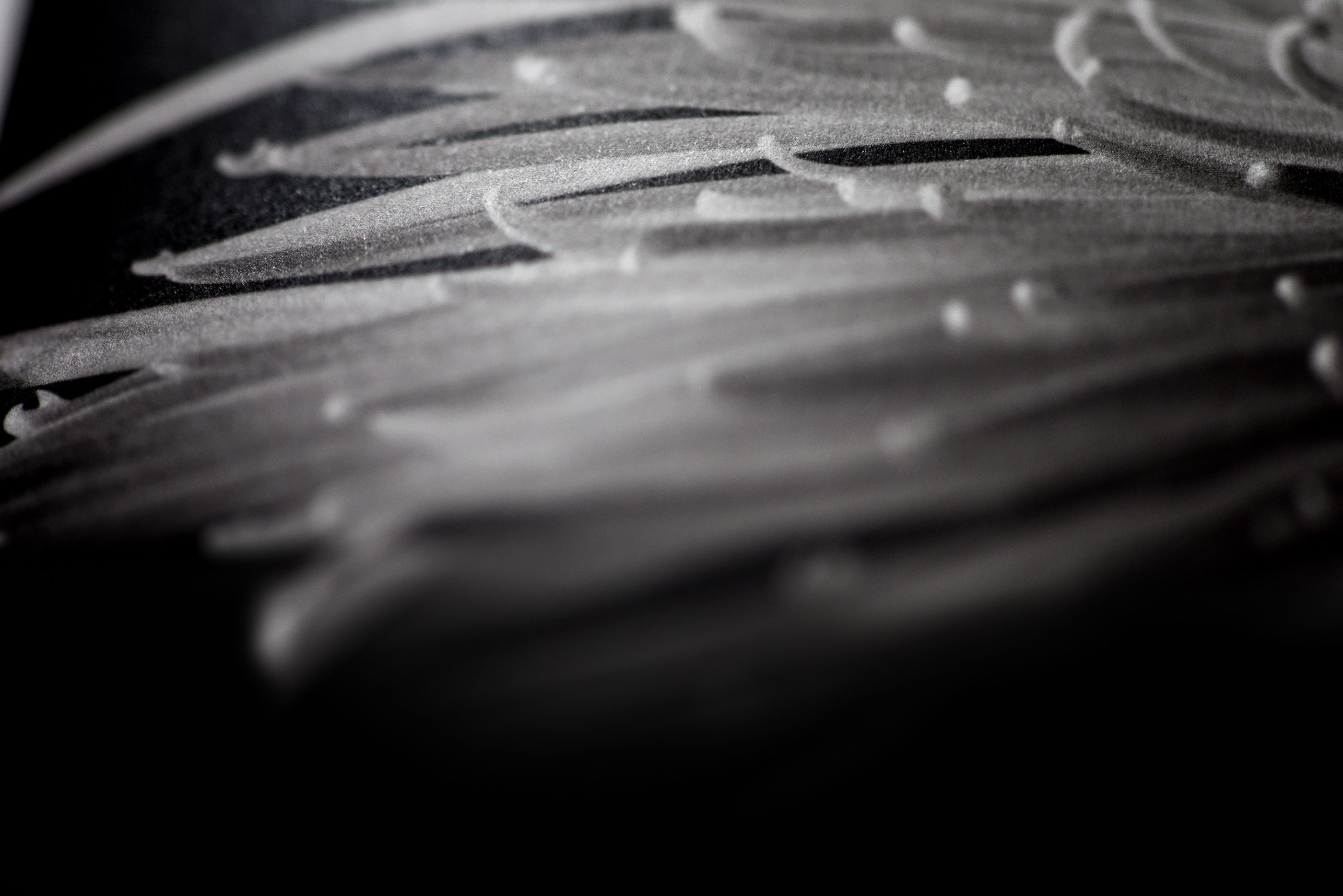
What could we do now as a key to tell the long traditional story of this particular print shop? Something that symbolized the magic that comes from these books? And there it was. The color powder (because they also make their own color pigments) sprinkled over the pages by the hand of a fairy!
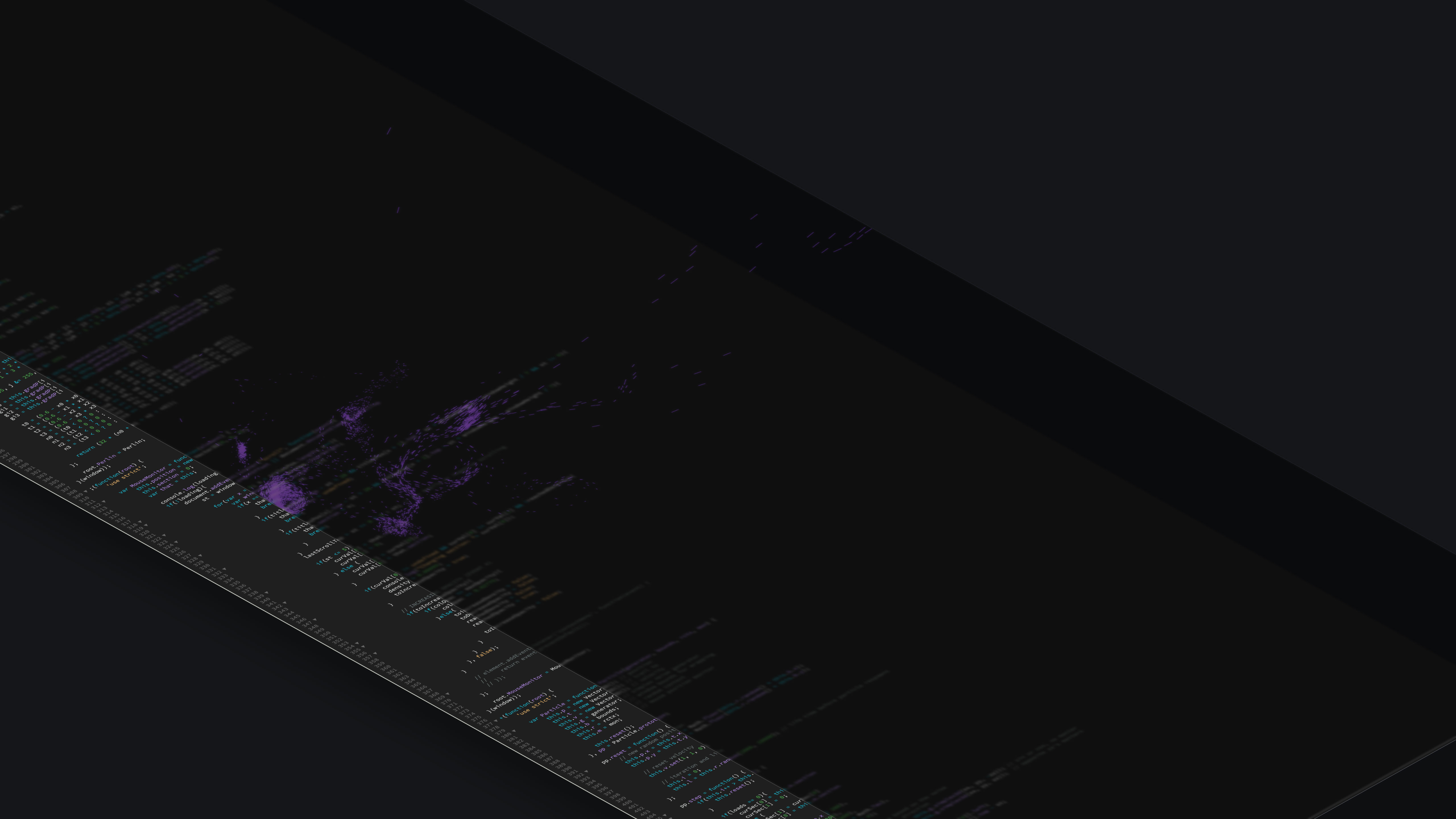
Particle Code Detail “Magic Powder”
To achieve this, we customized one of the fabulous particle scripts found on the web. However, some significant changes were required because we wanted the powder to expand itself as the user scrolled down the story. For each section, it should “magically” align with the chapter headings and disappear after a short time so as not to disrupt the reading experience. In addition, the powder should change color (5) smoothly depending on the color accents in the background photography (6).
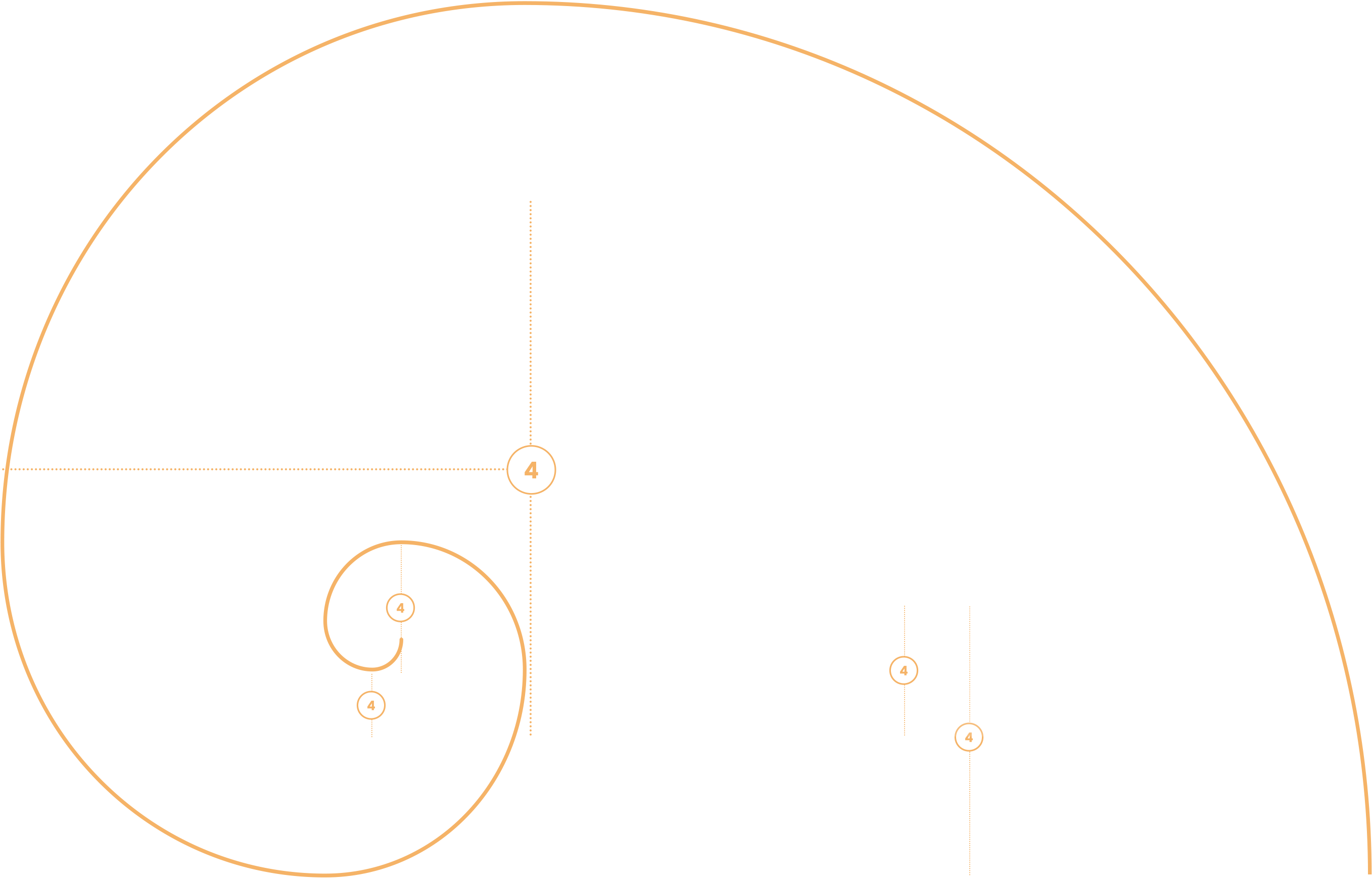
Grid System Based on the Golden Ratio
03. Some Magic Numbers.
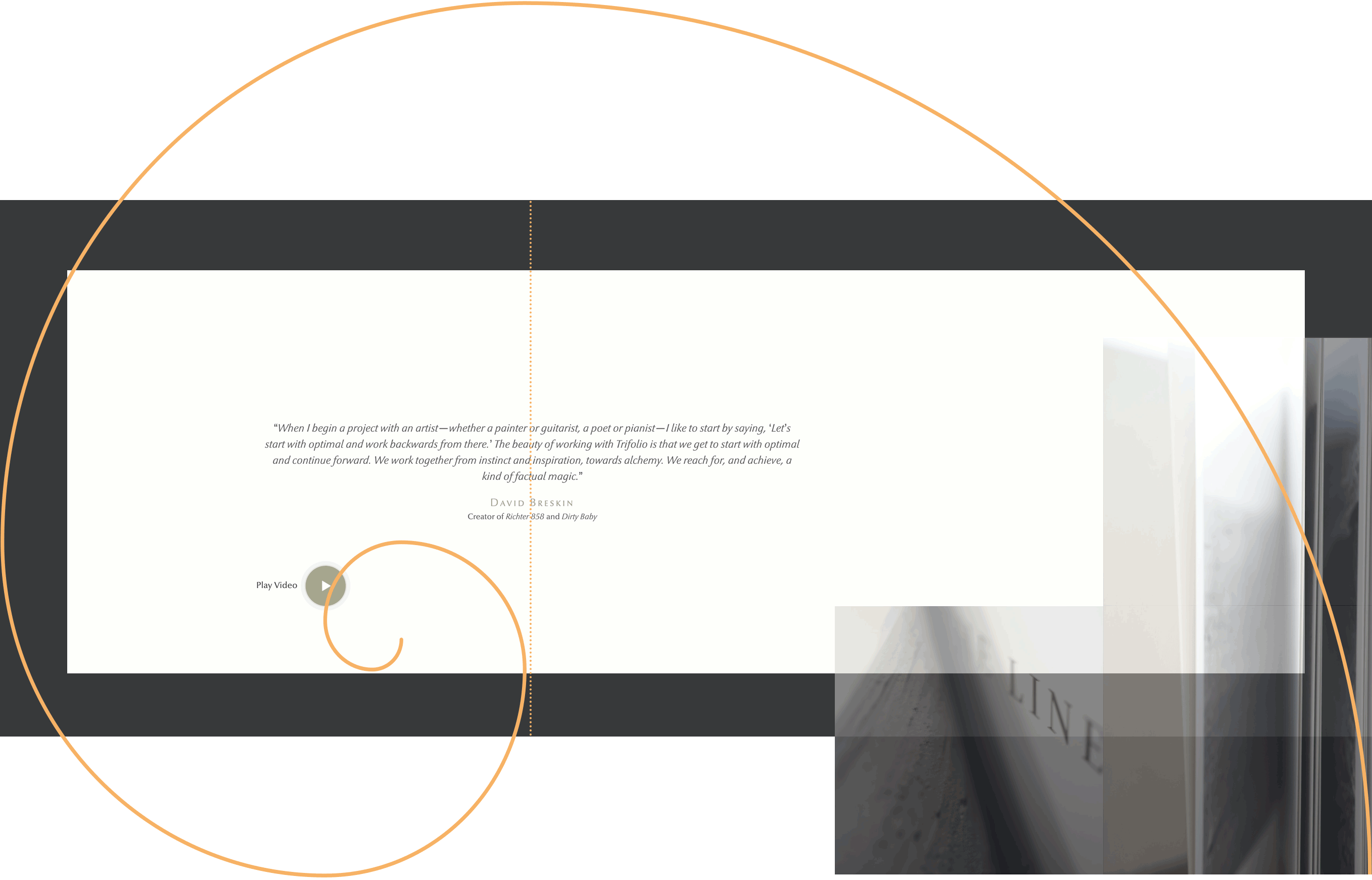
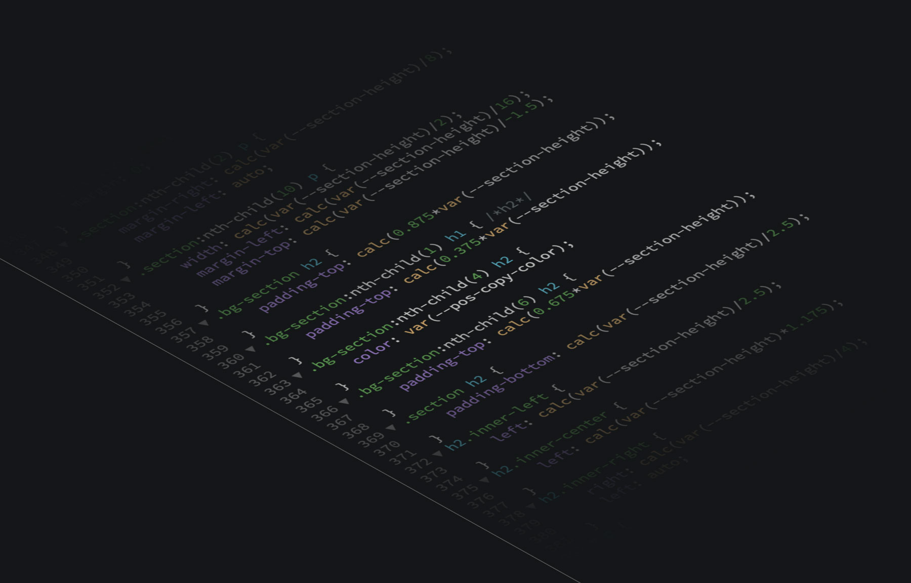
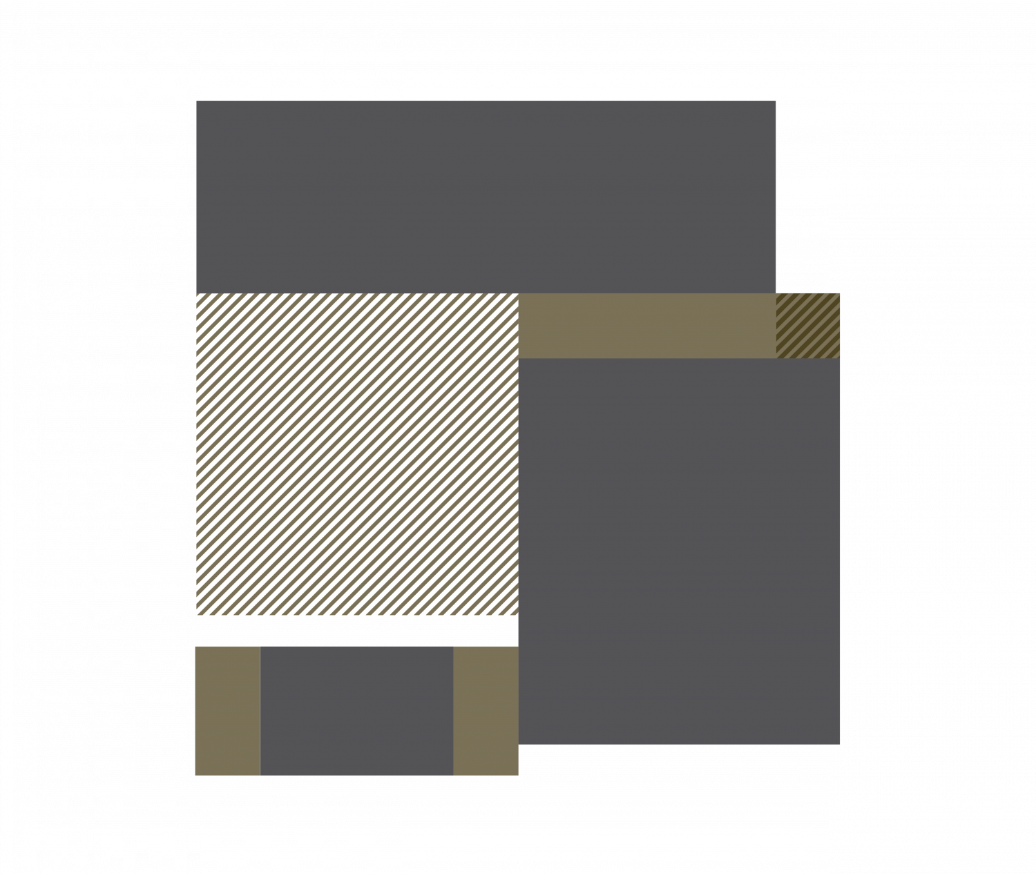
But what captivated us most about this project was the layout aspect. We’ve experimented a lot with CSS variables, and this time we wanted to go all the way. So we decided to use a single base value, which is 38.2vw (where 100vw is the total width of the screen), and thus the smaller divisor according to the ratio of the golden section 1/1.618. This sets the height of the foreground sections (4). All other measurements within the sections and the distances between elements are defined as fractions of this one number.
CSS Rules With –section-height as Unique Root Measure
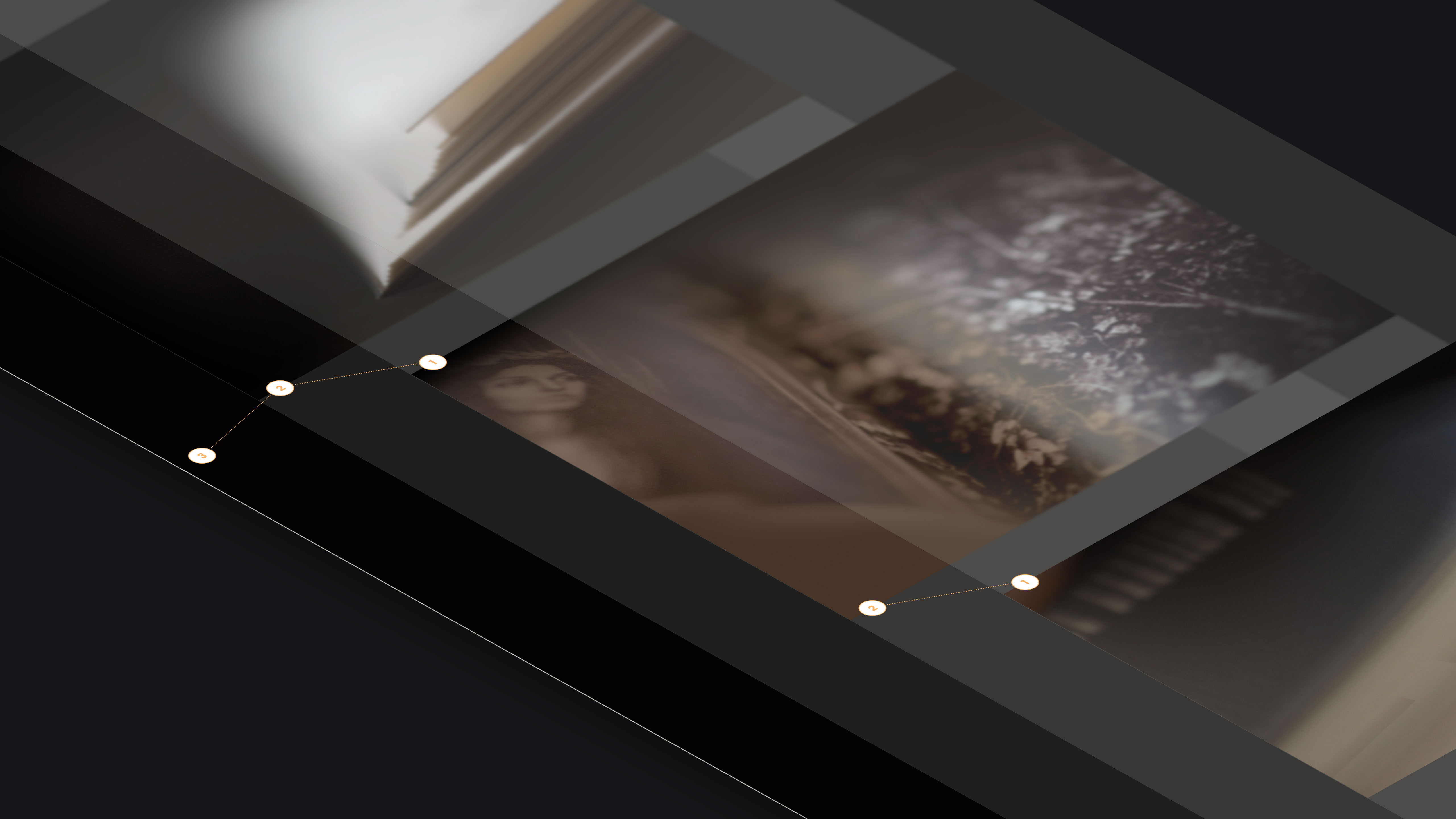
So when it came to the responsiveness of the website, we only had to manipulate a single value. All elements fit together perfectly, regardless of the width of the device. We also have a simple tool to “open” the gaps between the sections in the vertical for narrow devices to get enough room for the magic of the powder particles. The background images, which shift slightly against each other as the page scrolls, have been carefully retouched to invisibly close the gaps with an underlying common background color. (1–3)
04. Typography.
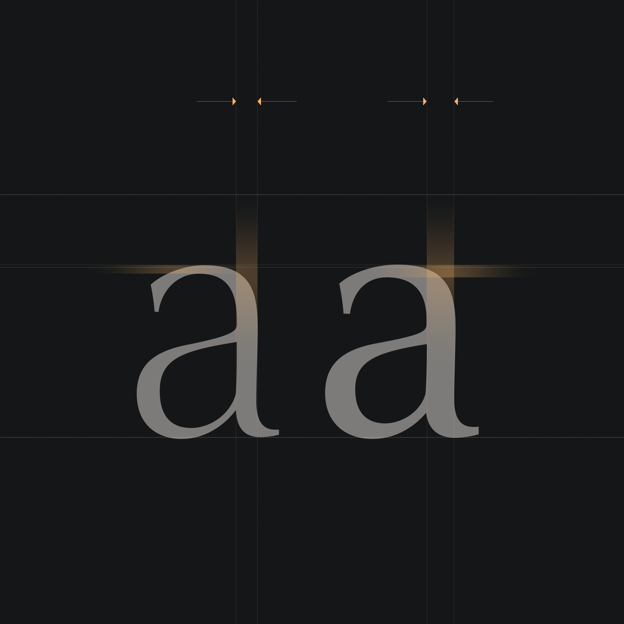
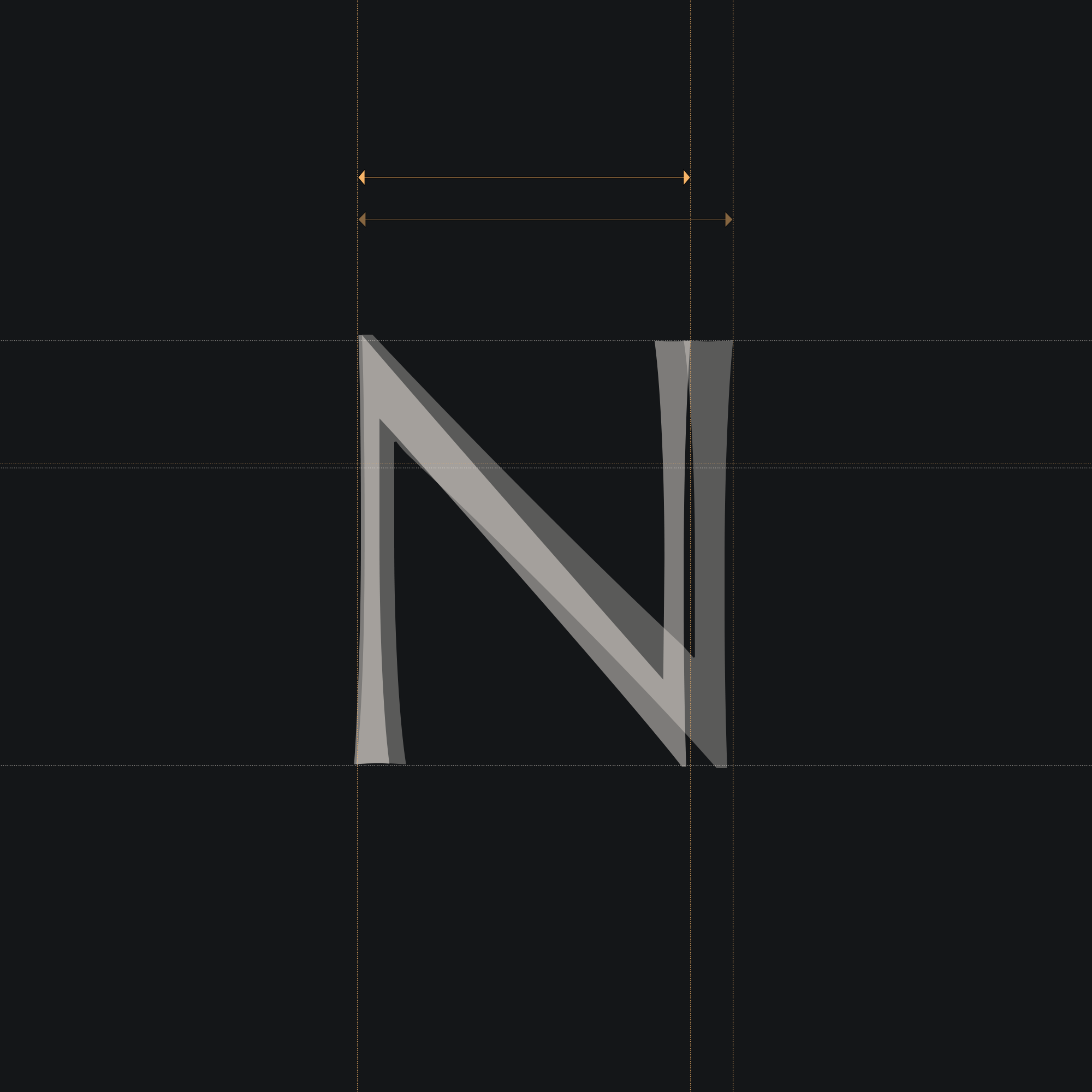
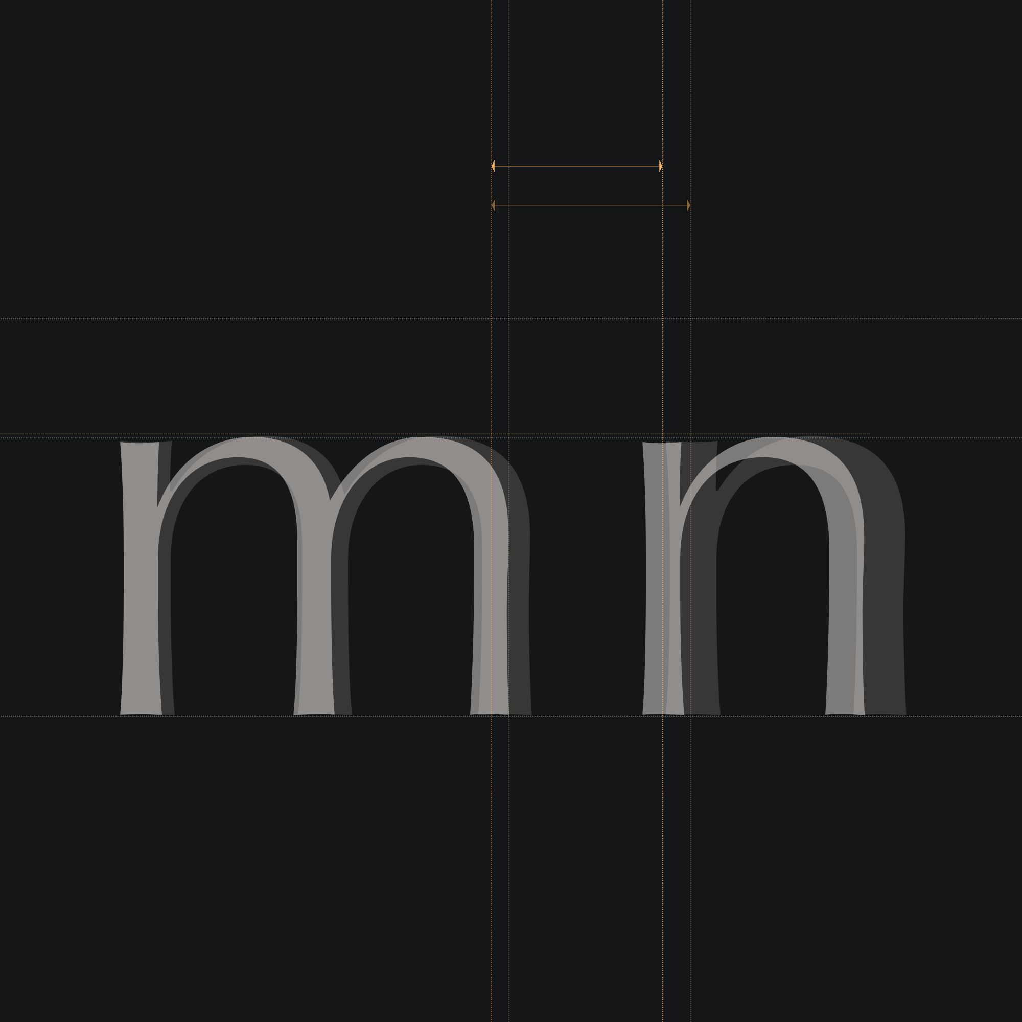
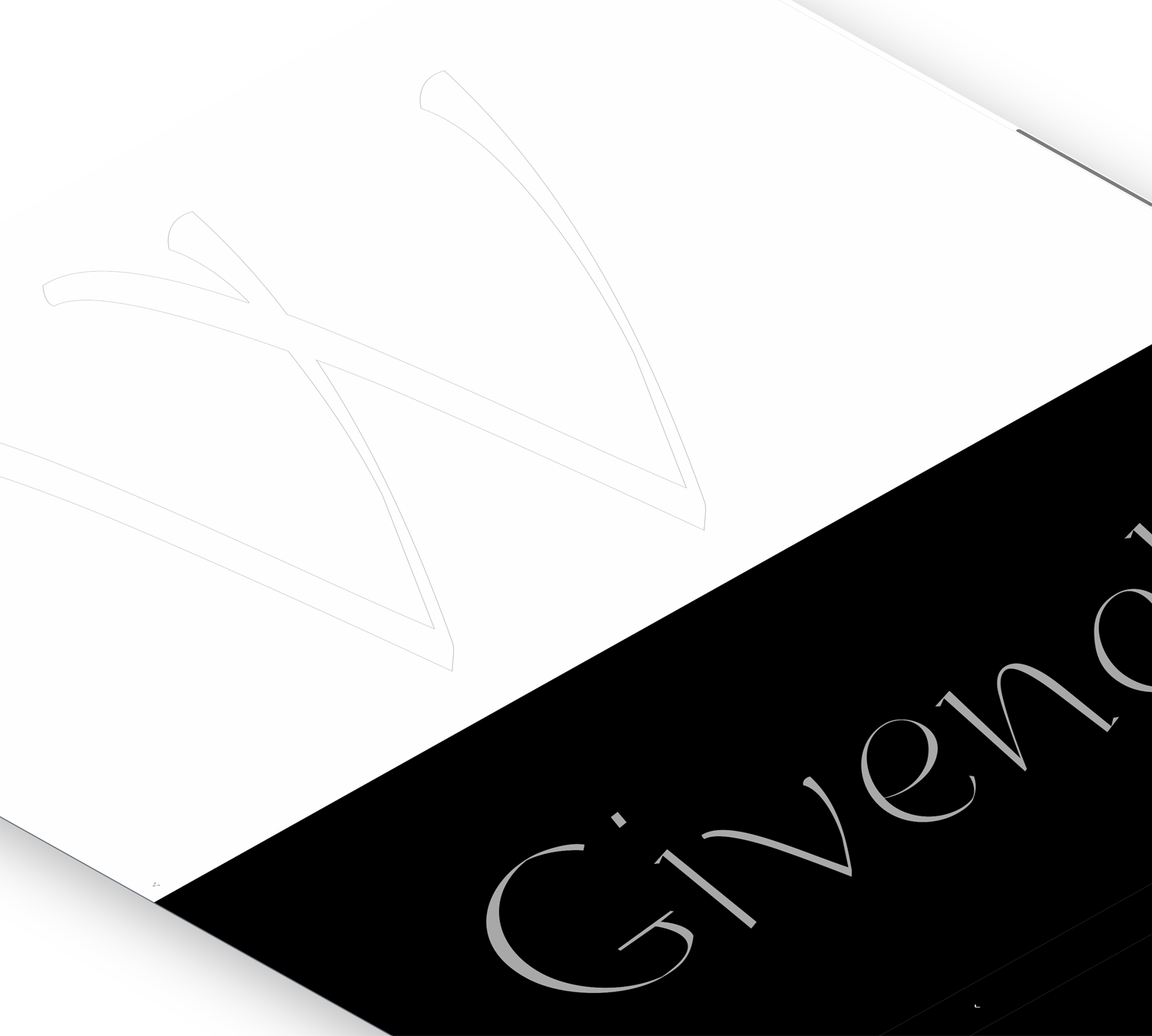
Another very interesting aspect of this particular storytelling website was the typographic design. Since we’re talking about and for book lovers, we felt it was necessary to focus on typography that would be both elegant and functional on all devices and in all situations. In part, work we had already done on the Trifolio parent website: the Trifolio web fonts. These customized fonts radiate their subtle elegance in large headlines with sublime line contrast and remain legible at small sizes. In total, we have created 13 font versions for one typeface.
These fonts differ mainly in terms of contrast and thickness of lines. The larger ones tend to have progressively finer lines and more subtle details as their rhythm tightens, while their smaller cousins do the opposite. Via CSS, the font variants also change smoothly as the browser window resizes. In addition, all families include different language versions with special features such as longer hyphens in American. This has ensured that the heavy database of Trifolios’ large portfolio does not need to be touched, yet typographic details have been corrected retroactively.
Related Articles
4Comments
Alessandro Nicolis
Utilizzo sapiente dei font e un contesto visuale perfetto. Molto bello!
Stefan Seifert
Thank you very much, Alessandro!
Indeed, the legibility and aesthetic quality of the font were very important aspects for our client. Using custom fonts also gave us the opportunity to optimize typographic details afterwards, simply by revising the already existing CSS files of the mother site.
Yours sincerely,
Stefan Seifert
Alessio
I was thoroughly impressed by the detailed exploration of the creative process. The way the team seamlessly combined photography, innovative web design, and a custom grid system based on the golden ratio truly brings the essence of Trifolio’s print craftsmanship to life. The attention to typography, tailored specifically for book enthusiasts, adds an elegant touch. This project beautifully highlights the tactile magic of Trifolio’s printed books and is an inspiring read for anyone interested in design. Great job!
Stefan Seifert
Thank you very much, Alessio! We are honored by such a nice and profound review, which convinces us that you obviously know a lot about the subject yourself. I will be very happy to pass this on to our team!