Website Layout:
uwe-reicherter.de
by Elementi
One of the certainly most challenging design tasks in the creation of digital applications is that of always thinking “fluid” in terms of layout. I often wonder what the glorious magazine layouters of the past as Brodowitch or Liberman would have felt about nowadays. I believe they would have dedicated exactly the same passion to it as they laid into their beautiful and stunning magazine double pages of the past.
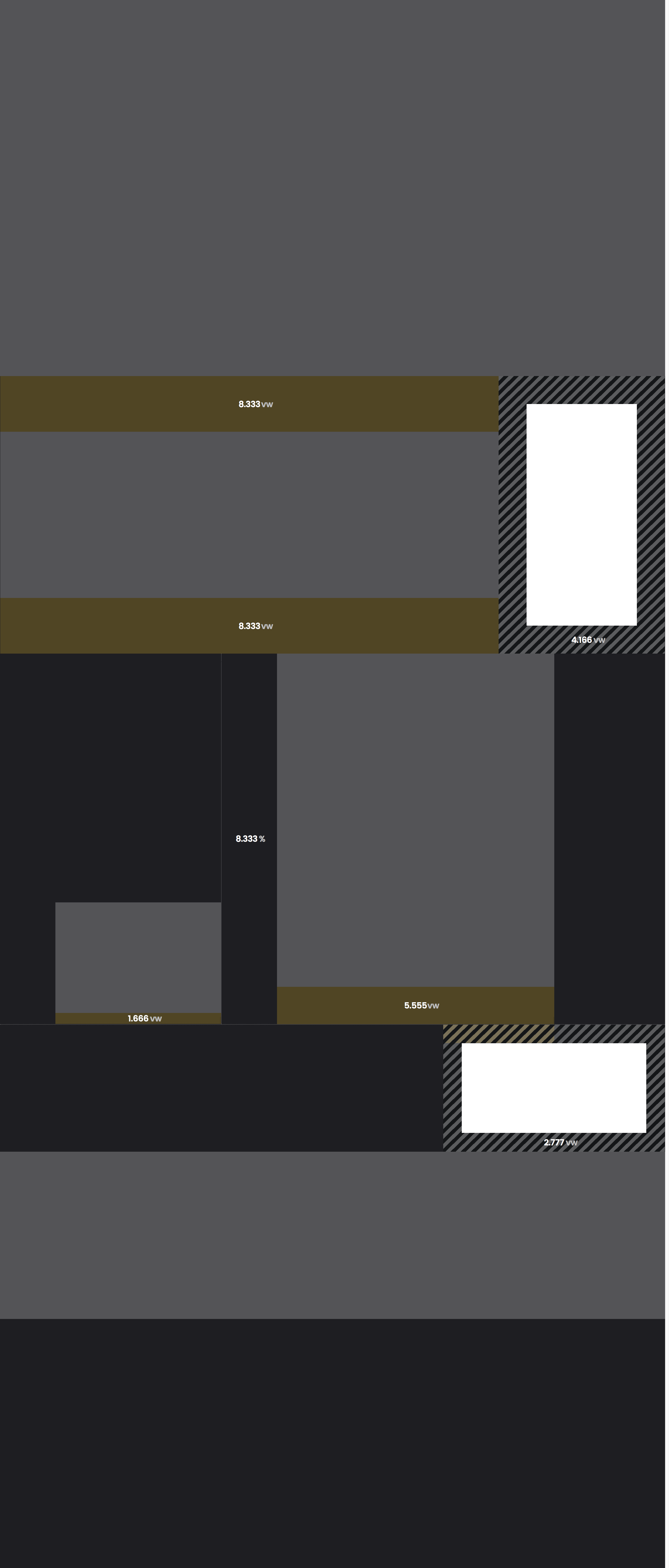
For our website creations, more and more consequently, we search to abolish absolute values as are pixels and generally not rely on values that reference to single elements rather than the page as a whole as is often the case with percentage measures.
This is because single elements tend to react on layout area resizing differently. In order to arrange them among each other in a horizontally and vertically scalable structure, composition values need to be in straight relation to device window size.

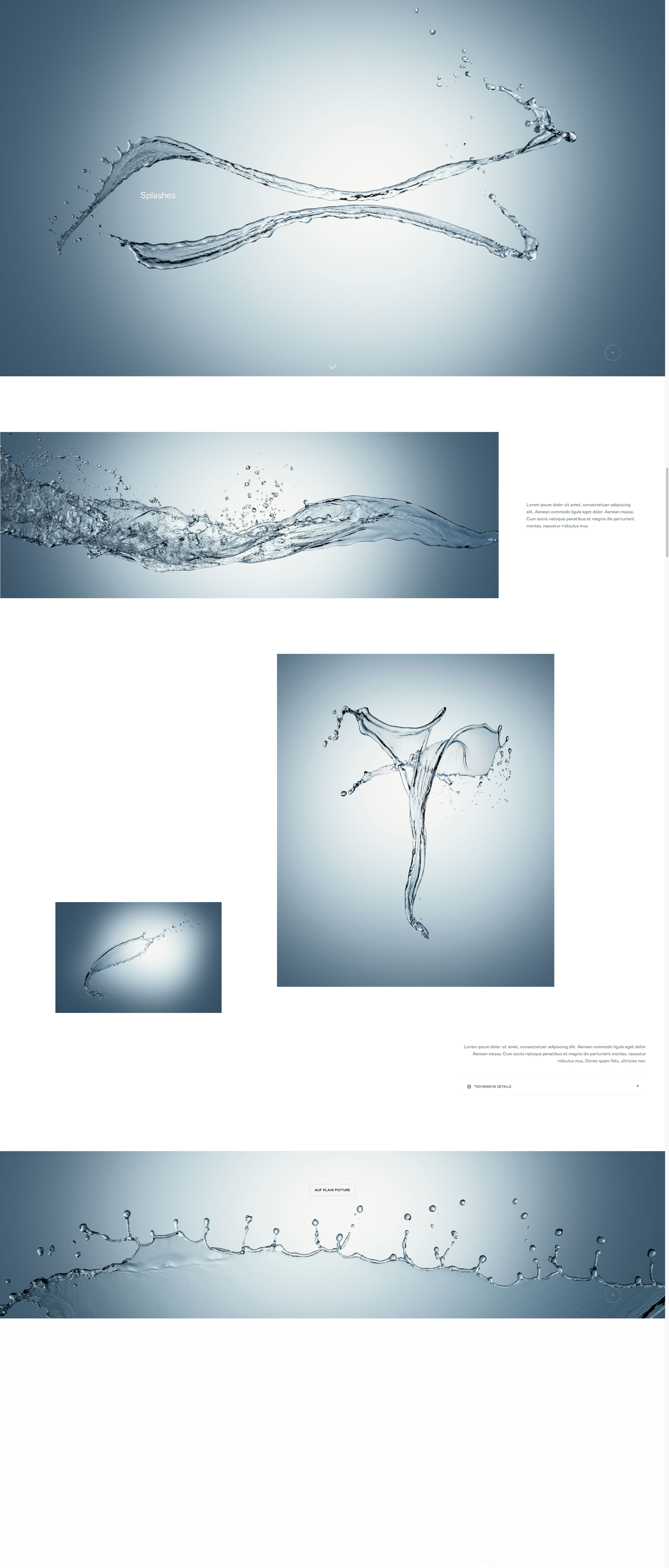
One of the oldest secrets in the art of layouting is that of taking control over the negative or white spaces. For the human brain blank areas have the same if not even more importance than the elements that they surround.
To create rhythm in length, width and in diagonal to make the eye travel*, it is more comfortable and intuitive to design the empty spaces straight forward. Not long ago you needed complex Javascript calculations to do so.
*An allusion to Diana Vreeland’s famous saying “The Eye Has to Travel”
Text font sizes (unlike headlines) should not change in a responsive desktop situation as they become unreadable when scaled down. As a result on smaller devices they will take more space in the layout relatively.
Using device width dependent measures helps us when it comes to combining white space around text with grid inherit distances consistently. That’s because we are able to draw them into calculation easily, even in more complex nested situations.

Mobile 1 Column Layout
At the end of the day “mobile first” is only half of the truth. If you want to build big webpages that deal with image material you need to calculate in that someone may want to enjoy them on an extra large desktop device. Today, image-oriented websites create story layouts with incredible scroll length. They put their prestigious photographic material on webpages that vertically grow in eternity while keeping creative picture arrangements. Build your websites for mobile, but if it comes to desktop: Think big or maybe better, think long!
CSS3 has great ways to finally build layouts in which images, text parts and most of all white space communicate with each other as they did in the great magazine layouts of the masters of the métier in the past. In order to create pages that expand fluidly in both width and length through a reliably tied layout and break down to mobile design in a simple straight forward way.
0Comments